PROJECT: Fleurare App ROLE: Team Lead DURATION: Ongoing
Project Vision
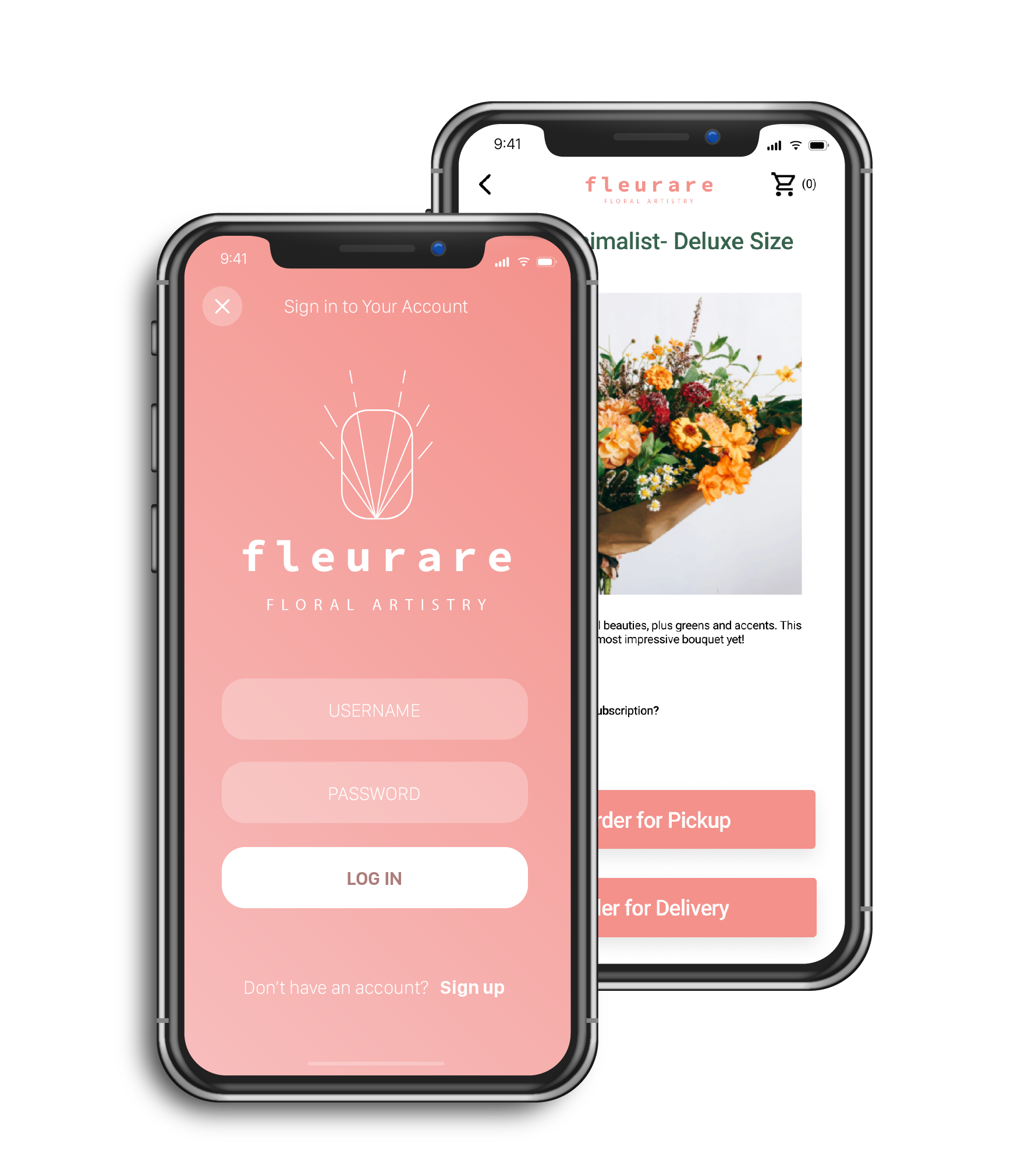
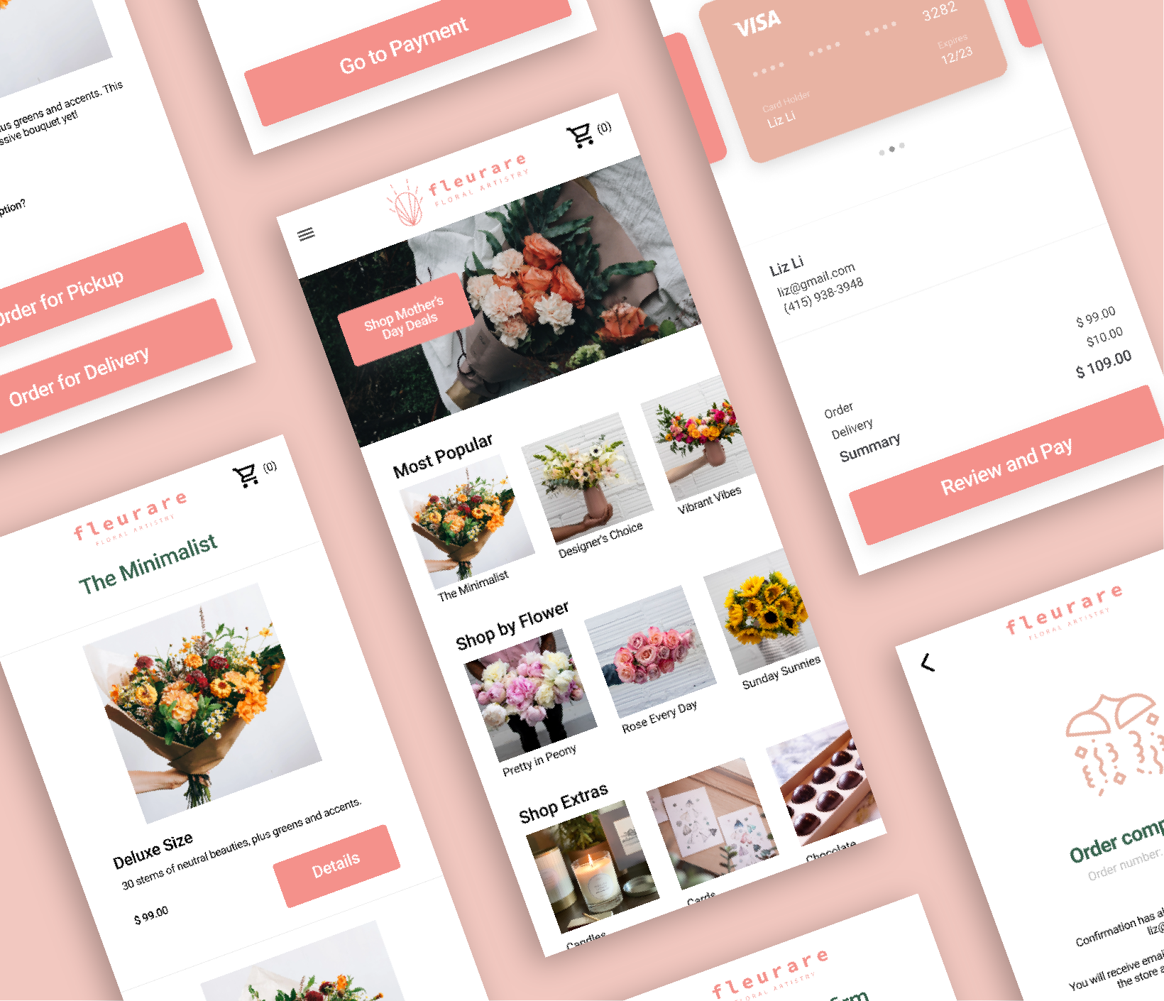
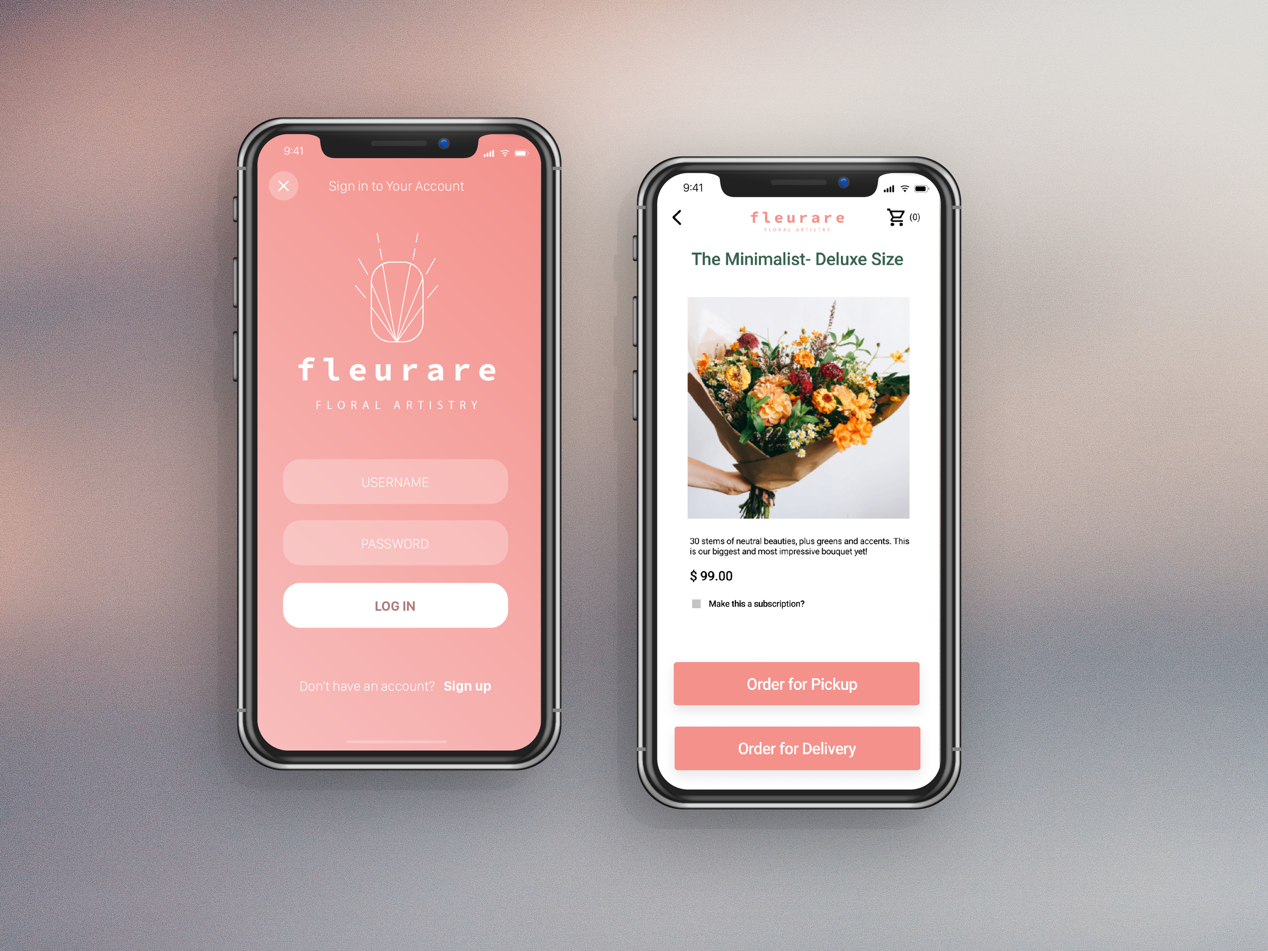
Fleurare is an app for a San Francisco florist who needed an easy way for people to order their bouquets. For this project, we aimed for a seamless process from start to finish and a curated list of choices, resulting in a quick and familiar ordering process for users.
Challenges
1) Eliminate barrier to entry on application startup
2) Design a cohesive interface for familiar and unfamilar users
3) Create a minimalistic UI while keeping products as the focus
4) Provide a seamless & linear purchasing experience
Kickoff
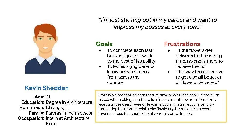
In this project, we took a goal-directed design approach that proved to be quite effective in our design efforts. We found qualitative research methods to be the most useful, consisting of a kickoff meeting, literature review, competitive analysis, stakeholder interviews, and most important our persona hypothesis construction. We started out by asking ourselves some initial key questions.
"What is the product and who is it for?"
"What do our primary users need most?"
"Which users are the most important to the business?"
"What challenges could we face moving forward?"
"Who do we see as our biggest competitors?"
"What literature should we review to familiarize ourselves?"
Mapping
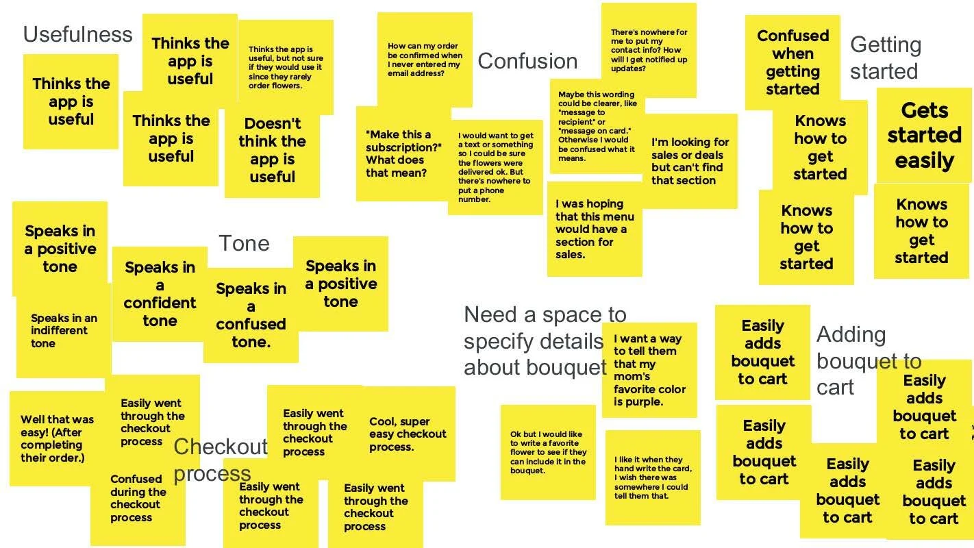
We found data from our initial user interviews to be the most effective understandings we garnered. We then used an affinity diagram to separate the data into groups of tasks which were further categorized by high level goals for improvement in usefulness, confusion, getting started, tone, checkout process, needing a space to specify details, and adding bouquet to cart. Recognizing the conflicts of interest from each audience allowed us to focus on shaping user goals and how those goals would in-turn also affect the business' goals.
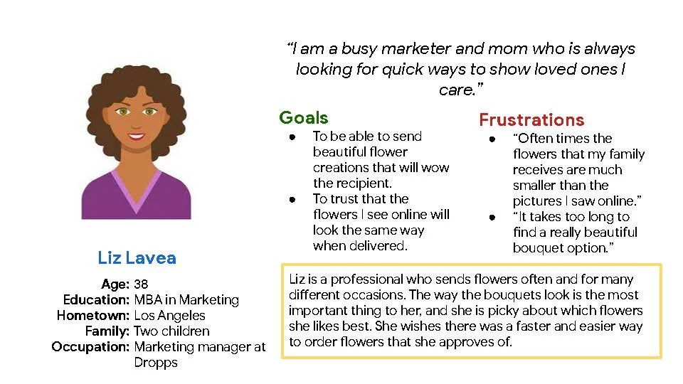
The Users
-
Competitive Analysis
We looked at several potential competing companies, some of which were direct competitors and some of which were indirect. We looked at competitors’ type and quality of product, market positioning, strengths and weaknesses, and overall tone.
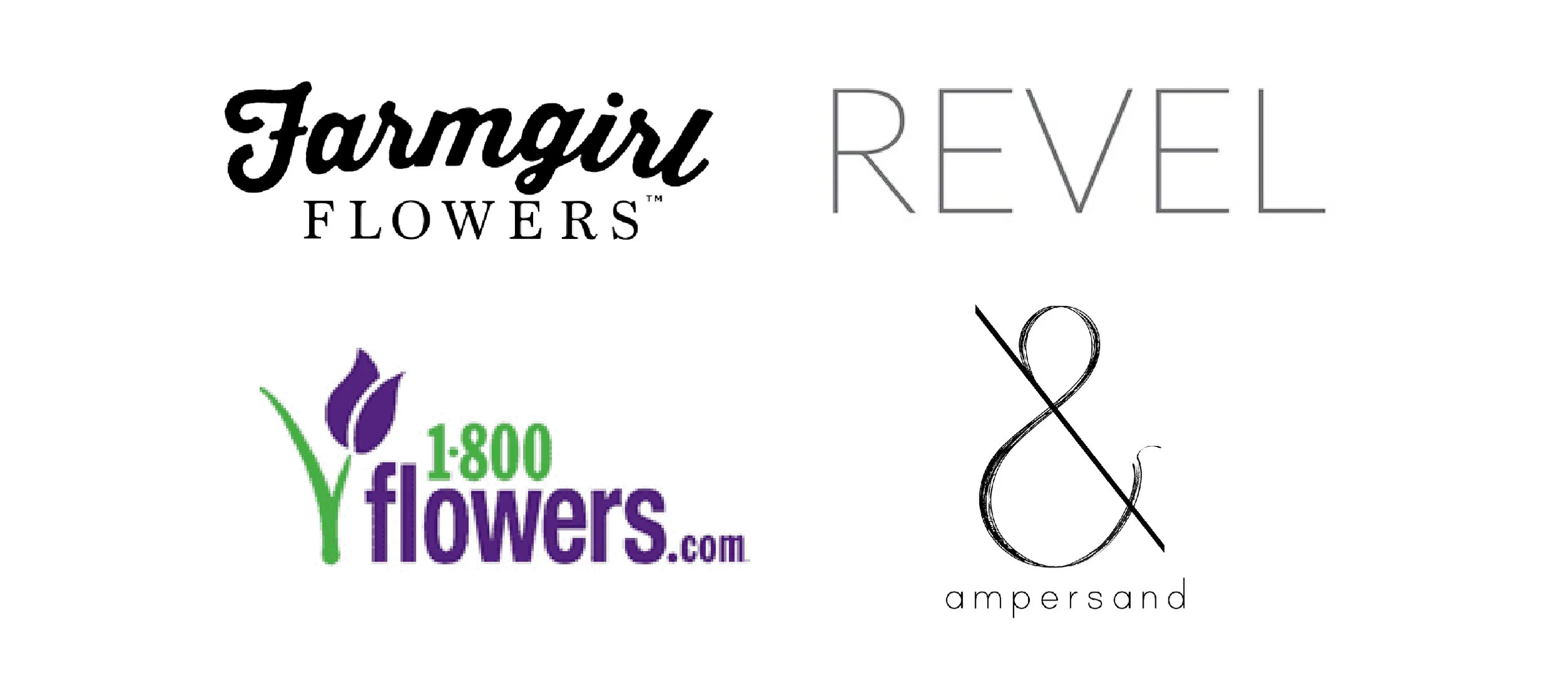
The companies we analyzed included:
A few of our key takeways were that the majority of our competitors:
– Had very difficult ordering systems
– Lacked strong branding throughout their website/app
– Employed a casual, conversational tone
– Had a good selection of products but they were not easy to browse
Preparing the Journey
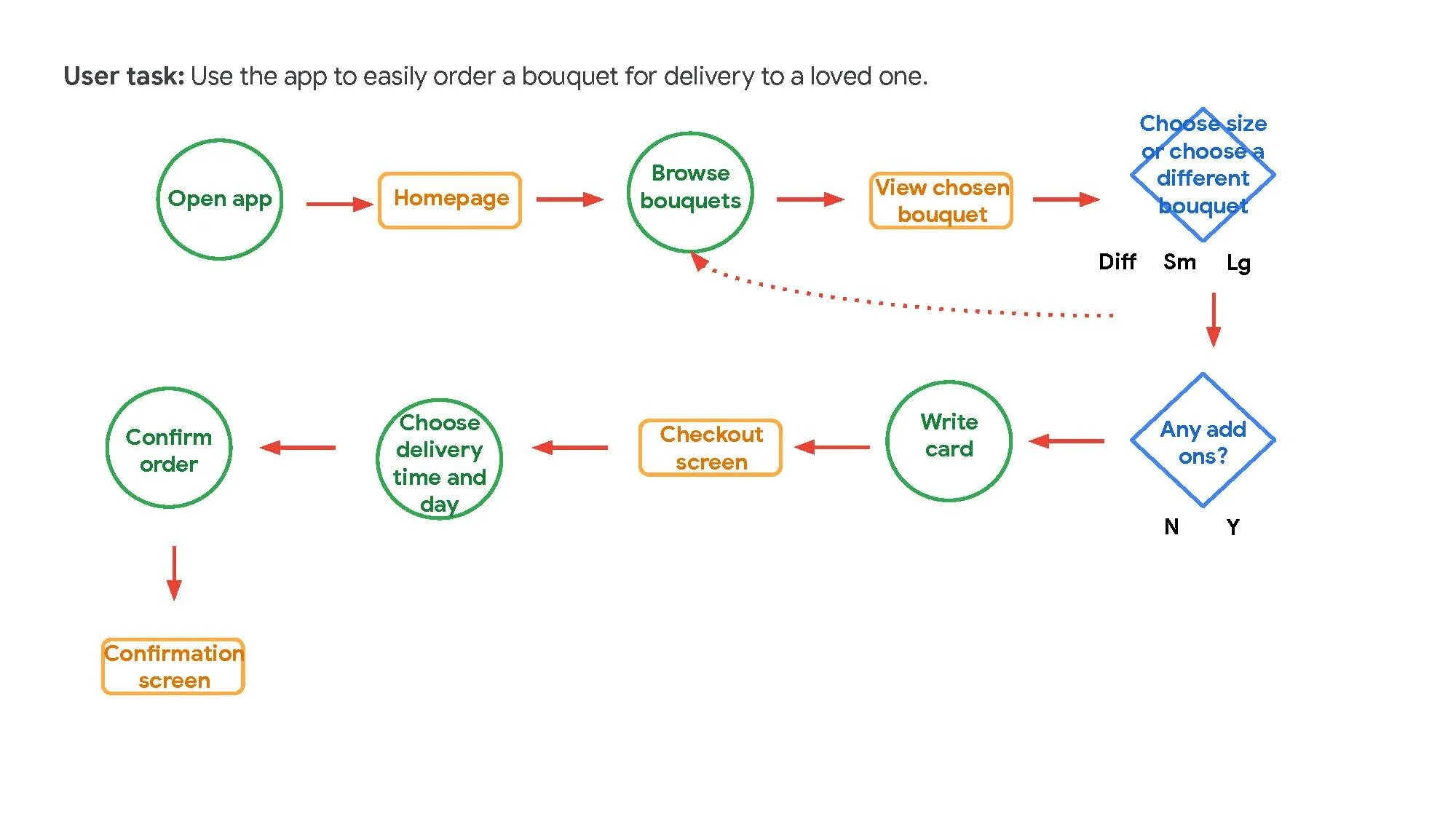
We constructed a user flow of what a basic start to finish journey looks like while purchasing an item. This helps us in understanding ways users can interact with the product, as well as allowing us to see navigation through user goals.
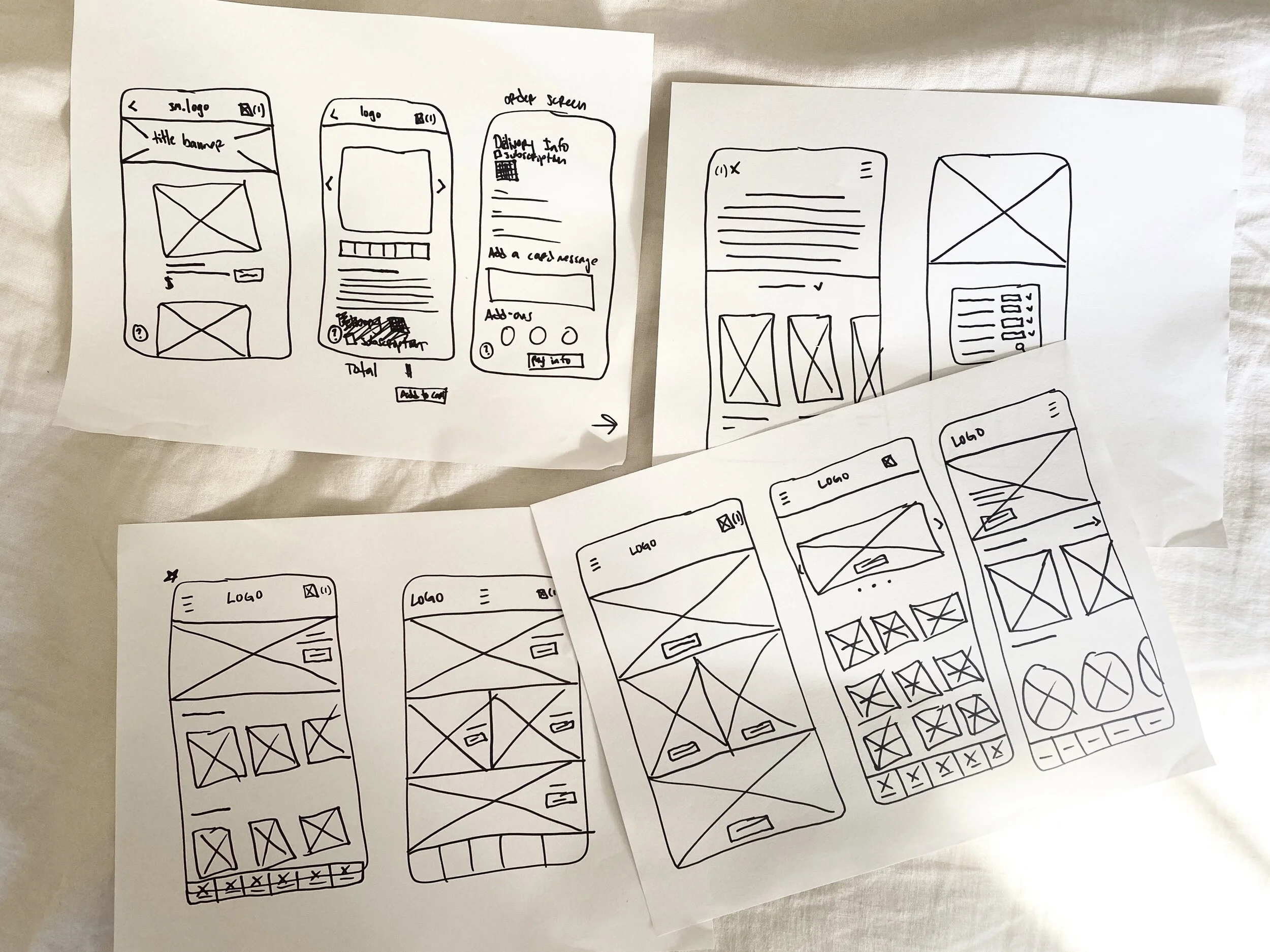
Pen and Paper Wireframes
Wireflow
After sketching out some p&p wireframes and thinking through the preliminary flow, we reviewed what was nessecary, unessecary , and what areas needed improvement. We poured a lot of our time into this step to make sure we had the finishing touches on the underlying UX before moving onto the visuals.
Iterations
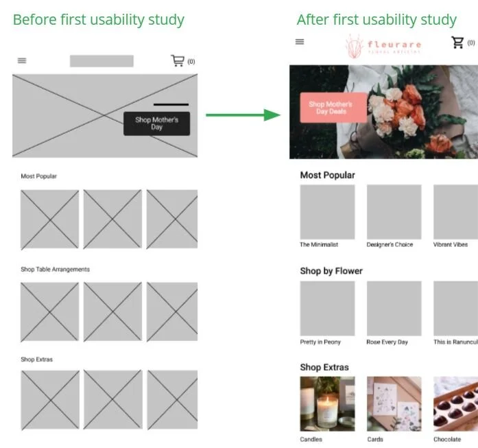
After creating our prototype from low fidelity wireframes, our team prepared a 16 question survey for participants to fill out before we began conducting a usability test. We asked participants to run through different scenarios in our prototype in hopes of garnering enough feedback to use for our next set of design iterations. What we found was:
Users wanted to be able to list their specifications, including special requests for their bouquet and card.
Users wanted to be updated on the delivery of the bouquet.
Users wanted to be able to quickly browse best deals on flowers.
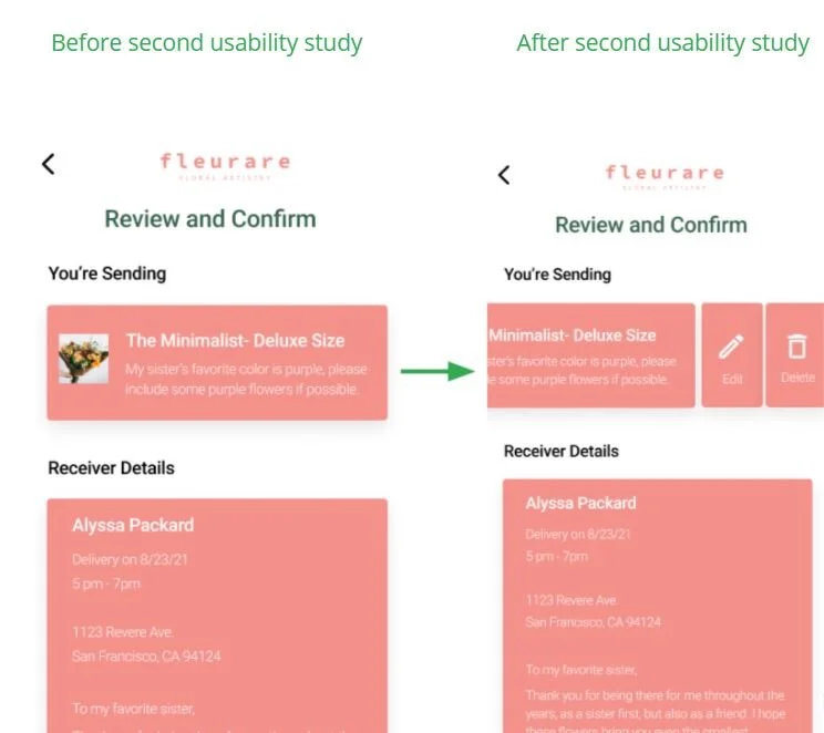
We then built our first iterations of high-fidelity mockups. We then went through a second round of user interviews to further streamline our app, where we found:
Users wanted to be able to edit/delete their order once added to their cart.
Users had a hard time setting up a recurring order.
Takeaways
As a mechanical keyboard enthusiast, Mechmarket is an idea that is near and dear to my heart. I wanted to communicate the importance expressing yourself through different creative outlets. This was my first time using the goal-directed design process , and I can definitely see it being useful in future projects. The idea of honing in on the persona hypothesis creation to help further the goals of not only the user, but the business is a step that I had taken for granted up until now. I learned that if you design for exclusively the business' goals, it will most likely fail; this seems to be especially true in shopping apps.
Be sure to checkout the process for thr Fleurare app's creation below!
